In this article, we will list the group components in order to create the options related to the product. For example, the product's colors and size, which we need some special text components to display them.Following is the location of a product's options components:Following are the option components which can be used to create a product's options :
Color#
This component is a set of options rendered as colors, in which the customer can select the color they want. It can be useful to present a product's color.Example#
Variables#
Usage#
The HTML element input_radio is used to allow customers to select one item at a time. The details of the product's colors can be displayed using a for-loop statement through the details object.Date#
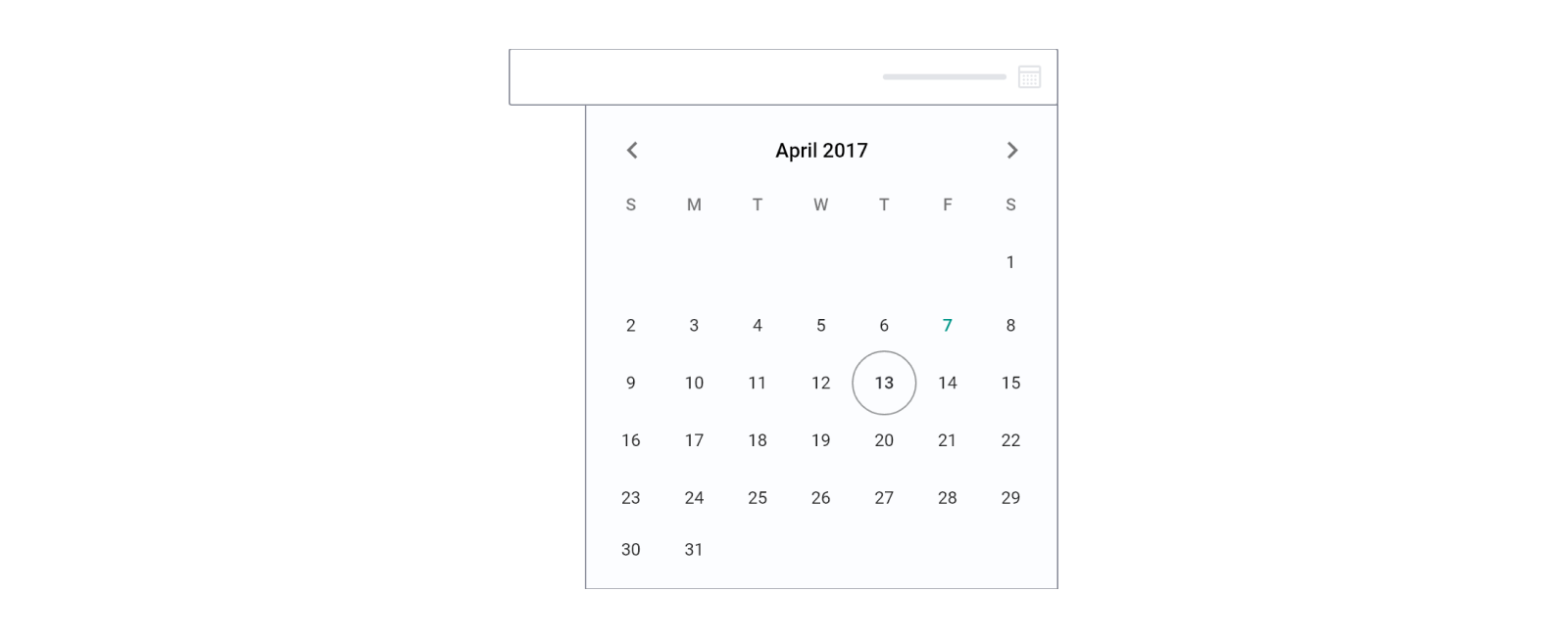
This component works as a date picker to allow customers to select a date. It can be used as an input field for the delivery date, as an example.Example#
Variables#
Usage#
The HTML element input is used to show this component with some predefined attributes.Datetime#
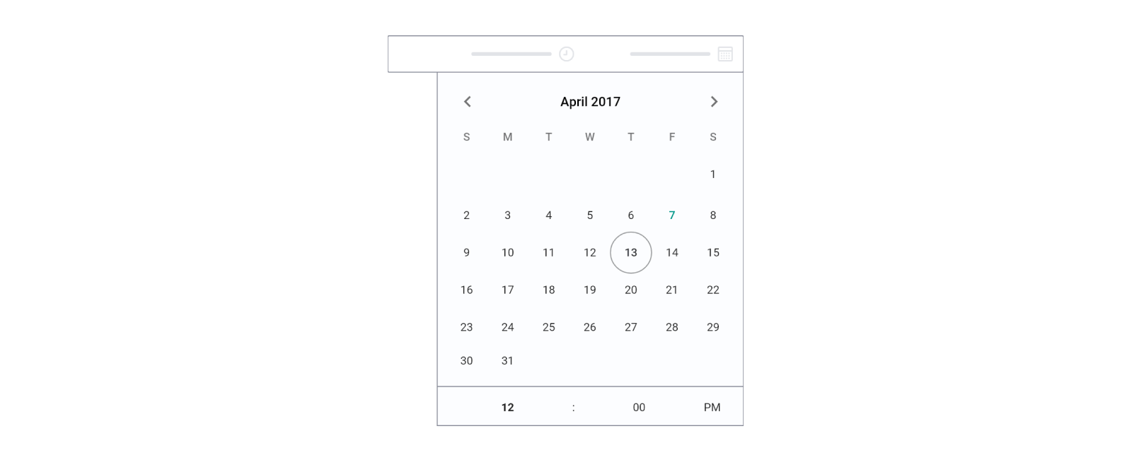
This component works as a date-and-time picker to allow customers to select a date and time. It can be used as an input field for the delivery date and time, as an example.Example#
Variables#
Usage#
The HTML element input is used to show this component with some predefined attributes. Some of the main variables here are option.placeholder and order_times.Donation#
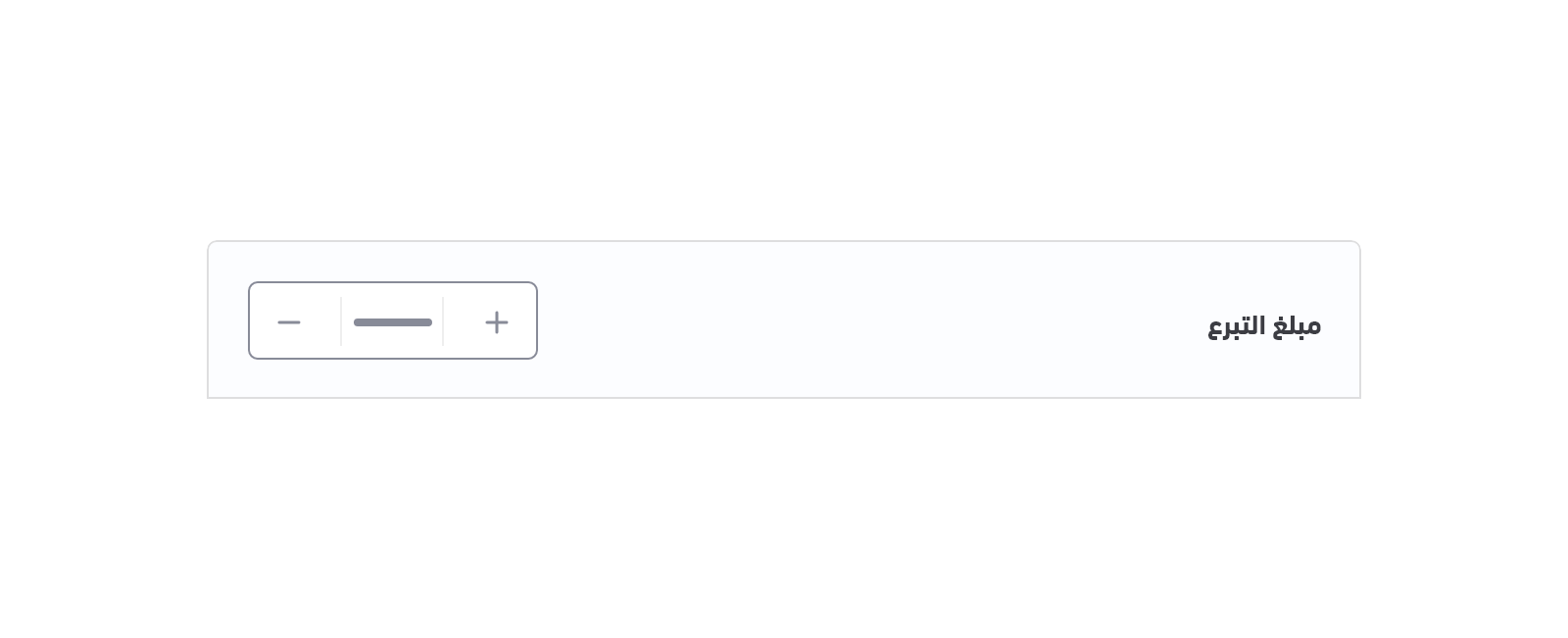
The donation component is a track bar that allows customers to set or adjust a donation value. When the customer changes the value, the donation amount will take the value of this track bar.Example#
Variables#
Usage#
In order for the customer to make a donation using the currently being viewed product, that product should allow donations. This can be checked by checking the variable product.can_donate. The price of that product can also be used as a default value by using <input type="text" value="{{ product.price }}" />.To check if the donation target has been accomplished, the developer can use the variable product.donation.completed.Image#
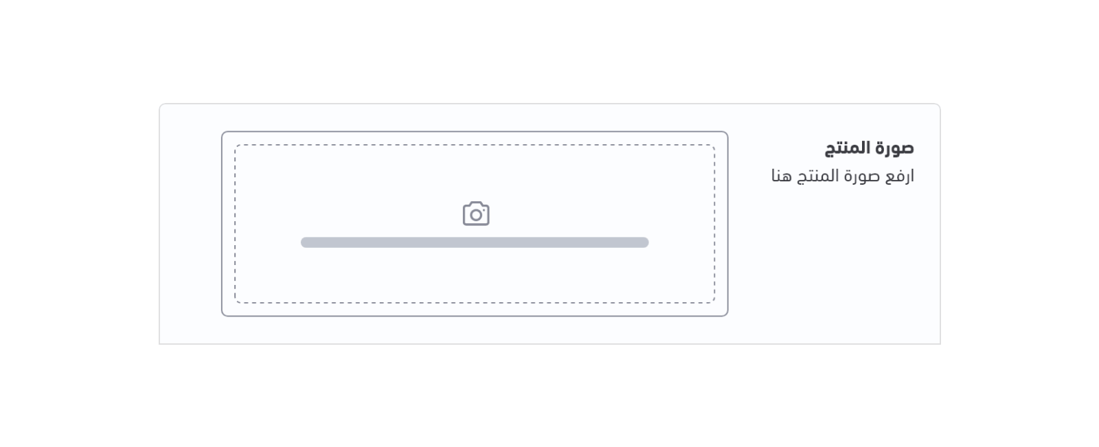
This component gives the user the ability to upload an image from the product page. It can be used in many ways, such as allowing customers to send more details about the product they require.Example#
Variables#
Usage#
The HTML element input is used to show this component with some predefined attributes.Multiple Options#
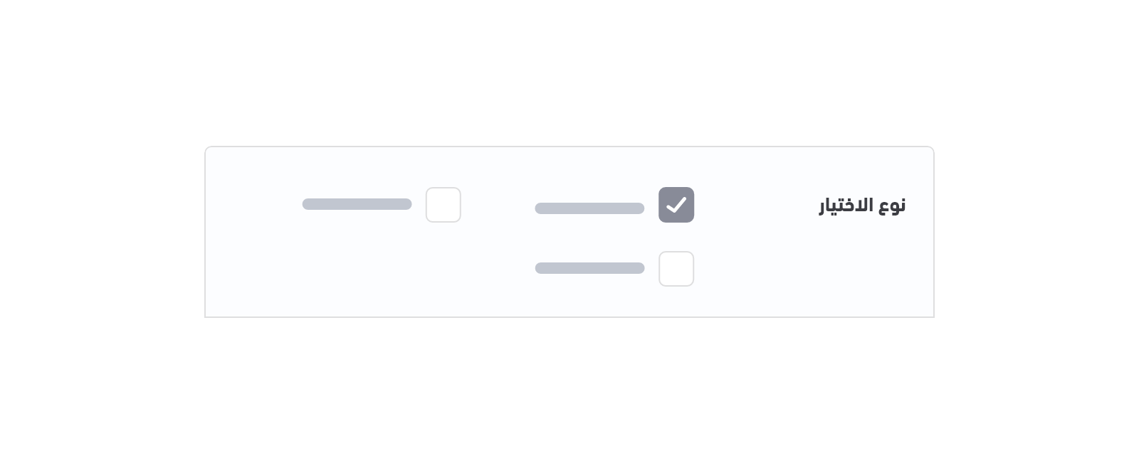
This component works similarly to "checkboxes" to allow the user to select one or more options from a set. Example#
Variables#
Usage#
The list of given options to the user can be retrieved and displayed using the for-loop statement through the option object. This list of options includes details such as full_name`.Number#
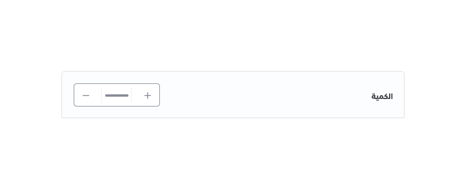
This component gives the user the ability to enter numbers, which can be used in many cases, such as entering the required quantity for a product.Example#
Variables#
Usage#
The HTML element input is used to show this component with some predefined attributes.Single Option#
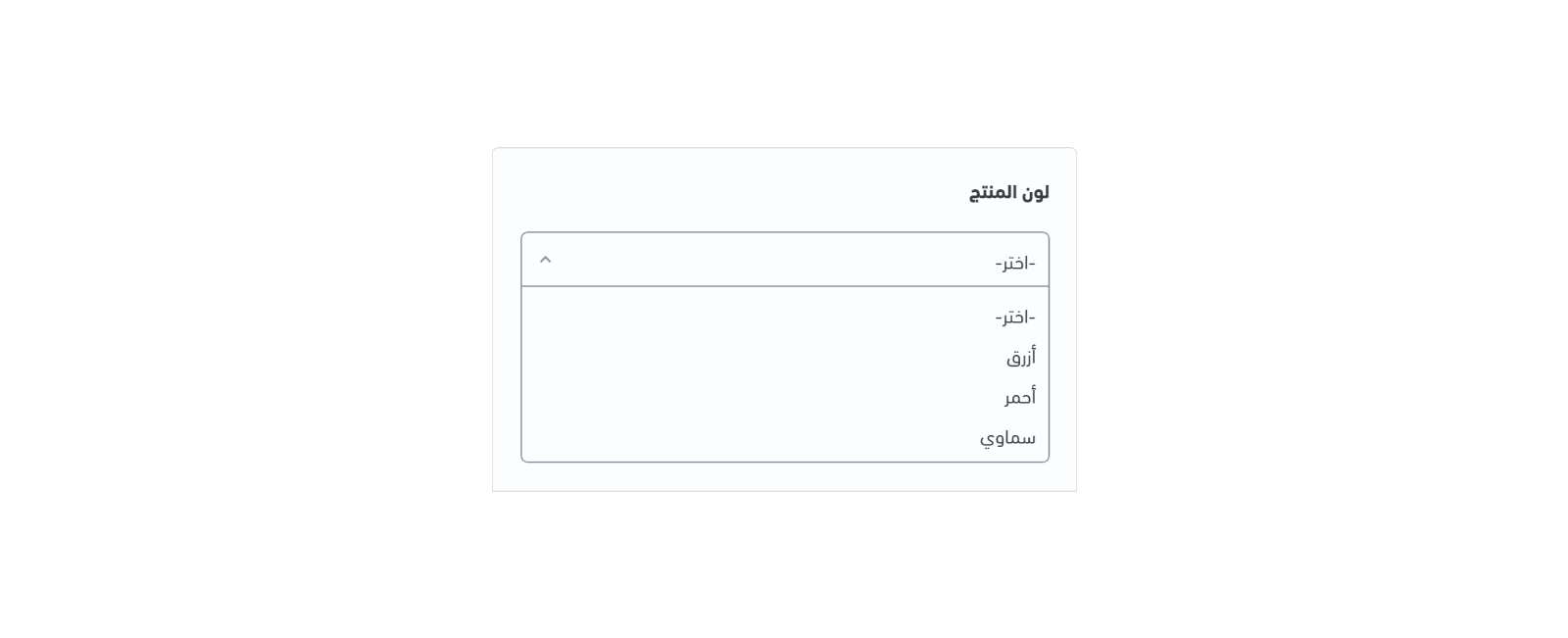
This component shows a list of options where the customer is allowed to select a single option at a time. The list is more compact and can support a longer list of options if needed.Example#
Variables#
Usage#
The HTML element select is used to show this component with some predefined attributes. Inside this element, a for-loop is used to iterate through the options which contains the list of the given options.Splitter#
This component defines a thematic break in a product page. It works similarly to the hr HTML tag in order to create a splitter.Example#
Variables#
Usage#
The developer has the ability to create a css class to style a break line. As shown below, we can apply this splitter class to any div element.Text#
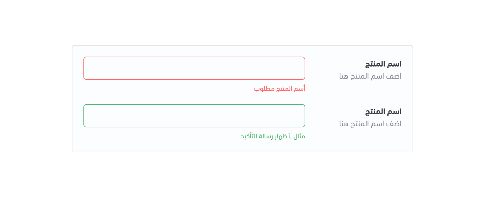
This component allows users to enter text. It can allow a single line and can be used to enter a product name, for example.Example#
Variables#
Usage#
The HTML element input is used to show this component with some predefined attributes. The option object is used to show any detail related to the component, for example, option.placeholder to set a default text as a start.Textarea#
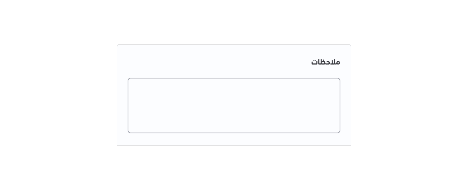
This component allows users to enter multiple line text. It allows the user to enter multiple lines of text and can be used to enter a note about a product, for example.Example#
Variables#
Usage#
The HTML element input is used to show this component with some predefined attributes. The option object is used to show any detail related to the component, for example, option.placeholder to set a default text as a start.Thumbnail#
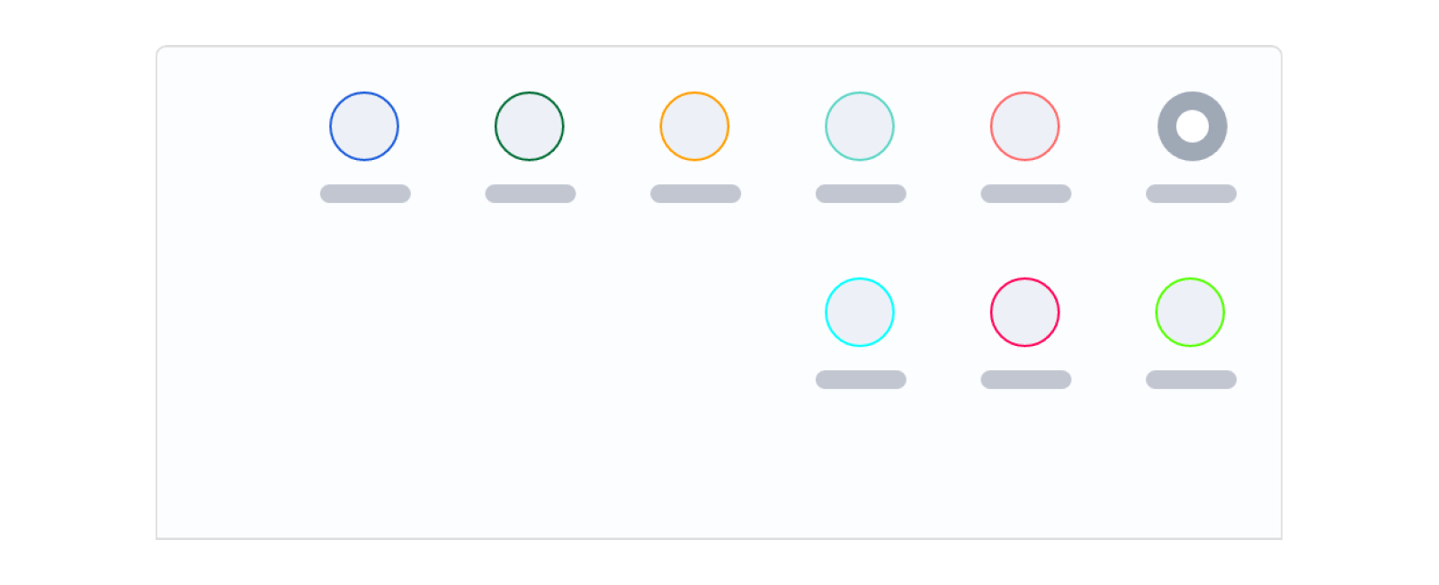
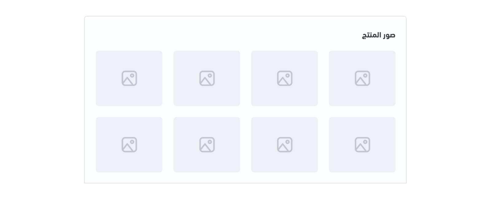
A thumbnail is a small image that represents a larger image when clicked on, and is commonly identified with a border around it. This component can be used to show example images of a product's options.Example#
Variables#
Usage#
The list of given thumbnails for a product's options can be retrieved and displayed using the for-loop statement through the option object. This list of options includes details such as detail.image` to display the thumbnail's image. This component may use the html input radio element in order to restrict the user to selecting one image, option, at a time.Time#
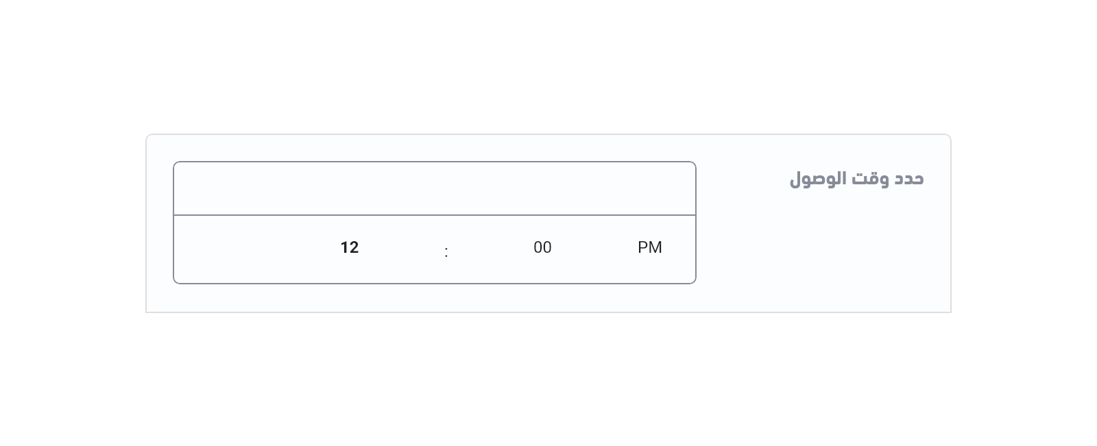
This component works as a time picker to allow customers to enter a specific time. It can be used as an input field for the delivery time, as an example.Example#
Variables#
Usage#
The HTML element input is used to show this component with some predefined attributes along with the option object. Modified at 2024-04-25 08:31:49
